Rithmm Player Prop Graphs
TRANSFORMING RAW PLAYER DATA TO INCREASE IN-APP ENGAGEMENT
Role:
Industry:
Tools:
Timeline:
Sole UX/UI designer
Sports betting tech / sports analytics
Figma, FigJam
2 weeks


View Next Project

10k
MAU
Increased user engagement
Increased trust in product
Introduction;
This project focuses on:
increasing user engagement and rebuilding trust by adding supporting data
helping validate picks at a glance
Rithmm is a mobile app giving users the ability to personalize sports betting models.
Definition Phase;
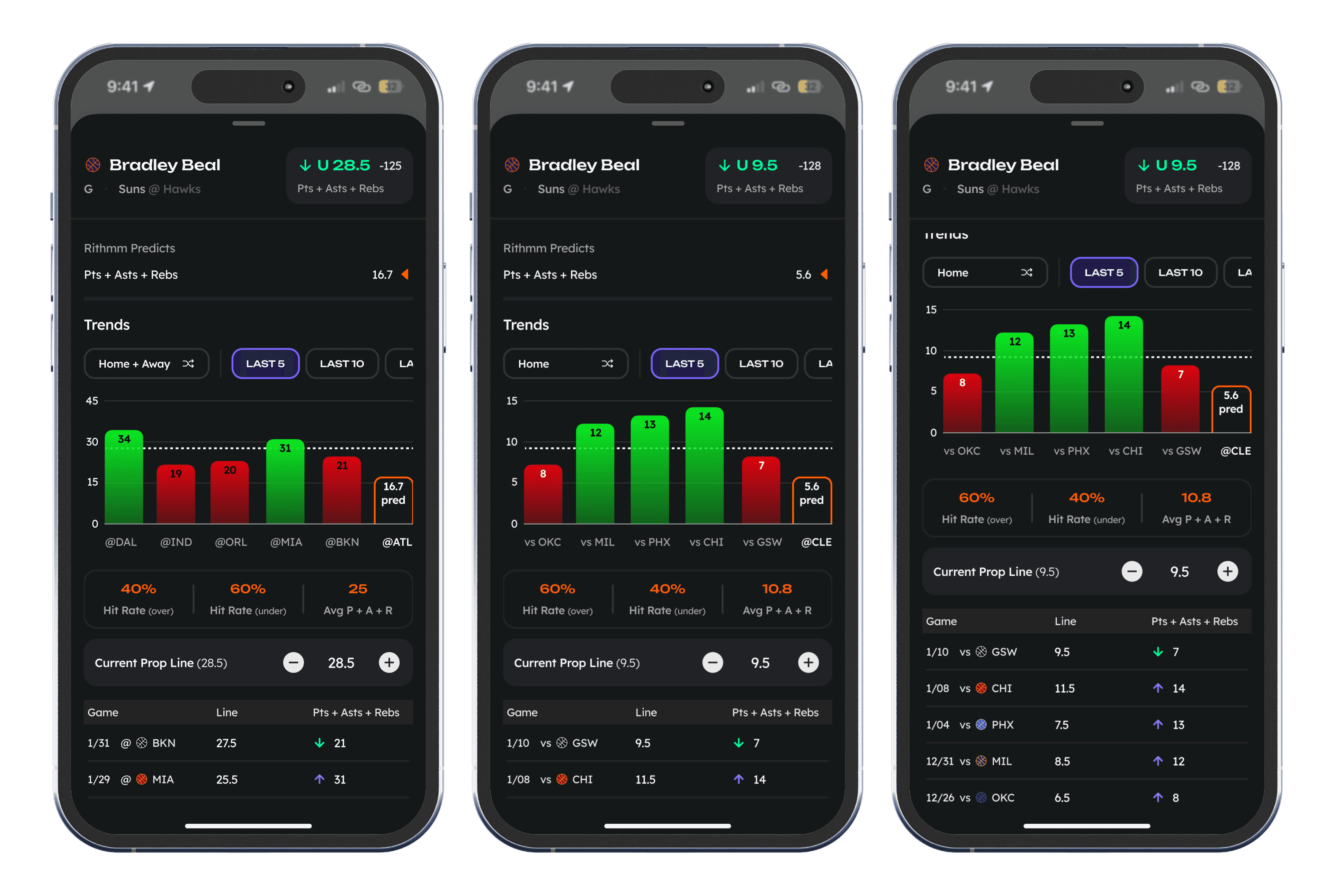
What we needed to display:
Timeframe toggles (last 5, 10, 20, season games) to give users control over the view
A bar graph showing past performance, with each bar color-coded (green = hit, red = miss)
A current line overlay to show how today's line compares to past performance
Averages for over %, under %, and average stat value
A vertical list view showing the line and result for each past game, giving users a fast way to scan detailed data
We needed to address the comments of "The pick could be coming from a coin flip for all we know…"
Sketch Phase;
Internal Feedback
After sketching, I presented to the team to get some internal quick feedback. This included:
remove the season timeframe option
add a home/away toggle
simplify hit rate and average displays
add up and down arrow icons in vertical list of game results
From Sketch to Lo-Fi
After outlining what we could display, I drew some sketches within the already existing player prop sheet and decided on a graph library to speed up implementation.

Technical Collaboration
Once the initial lo-fi designs were ready, I met with the CTO, backend, and frontend engineers to review the design and confirm technical feasibility. We aligned on:
What data the backend needed to deliver
How that data would be structured
How the frontend would integrate the graph library I selected

Prototype & Final Designs;
Outcome & Results;
The final design transformed Rithmm's pre-game view from a barebones prediction screen into a data-rich, visually engaging experience, giving users the transparency they needed to trust picks while encouraging them to engage more deeply with the player props overall.
Outcome & Results
This feature had an immediate and measurable impact on engagement and user sentiment. After launch, the player props page surpassed the game predictions page as the most visited screen in the app - a clear sign that users were gravitating toward the richer data experience.
In addition to improved engagement, we received overwhelmingly positive feedback from users, who appreciated finally having the missing context they needed to trust and understand player prop picks. This layer of transparency helped shift the perception of Rithmm's player props from "just another pick" to a trusted, data-backed recommendation.
Critically, the addition of this feature also reduced the need for users to leave Rithmm to do their own research on external sites. By providing recent performance data, historical lines, and clear visual trends all in one place, we became a one-stop shop for player prop analysis - keeping users in the app longer and creating a more sticky experience.
This outcome directly supported the product's larger goals of driving:
Higher engagement on player props
Stronger trust in Rithmm's model
Increased retention by making us a destination for research, not just picks
Check Out the ShiftForce's Employee Scheduler